Skip to content

I struggled so much with doing (the dumbest thing to spend so much time on) my footer for this website and my obsessive behavior with perfection led this simple task to take me over 6 hours to find the resolution…Well here’s the breakdown of what happened, how it looked and how I overcame the issues to figure out how to develop the front-end the way I wanted it to look and function.
So it always starts with me getting an idea of how to map it out using elementor and trying out different block templates and customizing based on other ideas. The main issue I had was the way it was pretty stuck and not as responsive as I desired. The other issue was I found this footer section using a plugin that pretty much limits the widgets I can use in it which disables my ability to put the “David Evans” touch that I like my websites to look like. Here is the first version of the image:
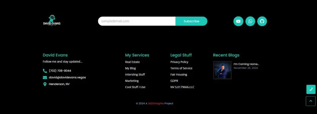
Overall the concept of this footer is what I was looking to do but the issue I had was that it was made up 3 separate rows with each row having a different amount of columns. What I wanted was to have a background that would span the entire footer section but not look chopped up. I deemed it not possible to line up the images because the viewport (size of monitor user has changes the way the website responds) variables and so I decided I needed to figure out how to structure it in a way that I can have one div class that features flexboxes and containers (even a grid) to get the results I was seeking, which can be seen here:
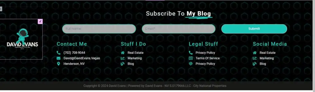
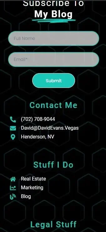
This second photo demonstrates much more of the style and usefulness I was seeking (form integration into my CRM and email servers etc) but I actually got the entire section to be one background! To be completely transparent, If I was to tell you how I got the containers to have different amount of rows and columns is still kind of a mystery at this point, but what does it matter if it works? Well, it ALMOST worked…until I checked the mobile version. That’s where I realized: “I am too deep into this rebuild and I will hate myself if I don’t go after it.” Here is the first version of my footer as seen in mobile format:

Well…that’s not good. As you can see above, the way the columns turned into rows tells me that I in fact did not build what I thought I did. Most people just find templates and change things out, but I like building my things my own way and generally I can code anything into place if I was using raw Bootstrap 5. Unfortunately, I am using WordPress and Elementor so I need to work within that environment and find a solution myself. But where does one go to find a solution to a unique problem? The answer is always to learn about the issue you’re encountering. In my case it was the structure itself and I didn’t quite understand flexbox the way I thought I did. So I turned to one of the best programming documentation resources available (will make articles in a separate blog category about this later). W3Schools is the best resource for learning how to touch up any issues you have in most programming languages. So I learned about CSS Flexbox and after an hour of fumbling through documentation and examples…I found the issue and decided to start Version 3!
I quickly realized that the error of my way of approaching the structure was because I used a grid instead of a flexbox environment and it never allowed me to structure the responsive measures the way I needed. The good news is, I realized the result I needed was indeed possible! What did I have to change in order to get this to work? Well I will show you in a quick mockup drawing I made on Moqups which is an easy way to make wireframes and visual templates for projects:
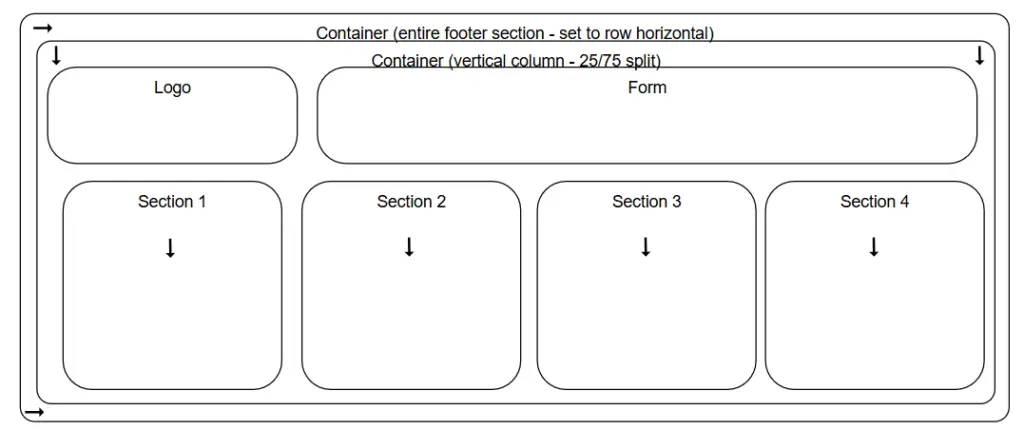
As you can see I used no grids this time and just made sure that every container would “stick” together so that the headline and icon list underneath would stay together in the same element. NOW WE ARE IN BUSINESS! So I remapped everything and started building Footer Version 3 and felt confident that it would work. Here is the desktop version and I just had some different adjustments so that I could control the size of the custom SVG hexagons in the back by setting a horizontal size and allowing the containers to flex over the image instead of pulling it and scaling it along with it. Now here’s the revised Desktop version:
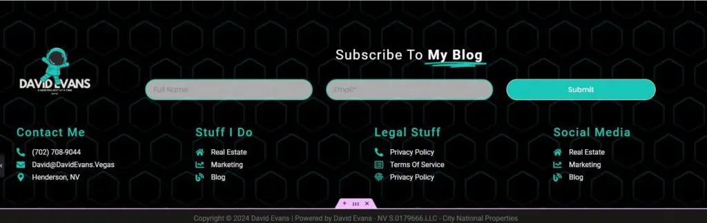
This looks very similar, but it looks like we may be ok. Let’s test mobile:
Boom! 6 hours to figure this issue out. Some may call it a waste of time. However, I promise you one thing… I will never have this issue again now that I taught myself how to use flexbox. Hope you enjoy the buildout of my website! I have always wanted to document my work and despite many people telling me not to share my knowledge. Here I am, and I will cite all my sources so you can learn too!

